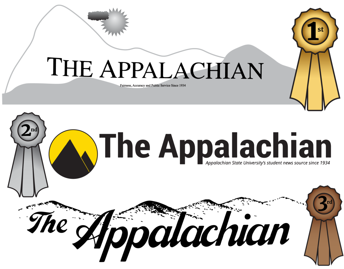
The Appalachian has been delivering the happenings of and around App State for 90 years, and with these nine decades inevitably comes some interior design changes. At this point, The Appalachian is an old lady; would she really still want her room to be the bright teal color she begged her mom for when she was 12? Absolutely not. The paper has undergone many banner changes over the years, with some being a lot more aesthetically pleasing than others. The following 13 banners are what I consider some of the best and worst of the 90 years, ranked lowest to highest.
Used in the 1990s, this banner incorporates two popular App State trademarks; mountains in the background and a large A at the forefront. This banner would have been much higher on the list had the formatting been slightly different. If the banner itself was slightly wider or the A slightly smaller, the overlap would not occur, making it look a lot cleaner. Contrarily, there could be a pattern of overlap throughout the entire banner, which would make it look more put together. Unfortunately, the overlap of the A and subsequent p in this banner almost looks accidental, putting it last on the list.
With the bold lettering, this banner was used on and off throughout multiple decades and is as classic as they come. The banner also had a subheading; “Fairness, Accuracy and Public Service Since 1934.” While you can never go wrong with the classics, it is way more fun to branch out and see what else you can do. This banner is certainly one that could be used for decades to come, but overall is not as enticing as some of the others.
This is one of the more recent banners, making its debut around 2010. While it does incorporate App State’s signature colors, it is not the most pleasing to look at. The shadowing behind the letters is very 2010s-esque, which does not allow it to translate to current times very well. The yellow is a nice touch but could have been applied to the lettering instead of just a line underneath. Overall, the idea is there, but the execution is not.
No. 10 on the list is the same font and spacing as No. 12; the difference is the subheading. This banner, used in the 1960s, reads “The News and Editorial Voice of Appalachian State University.” This subheading seems slightly more professional than the one of No. 12. It also encompasses the entirety of The Appalachian in a better way, including the opinion side of the newspaper. This slight change is what puts this banner above the other.
Though this banner does revert back to the subheading of No. 12, the font brings it up a couple of places in the running. It is a much wider banner in a font that is not only more bold but also easier on the eyes. There is absolutely no way to miss that you are reading The Appalachian, as the banner catches your eye immediately. The in-your-face nature of it bumps it up in the ranks.
Also used in the 1990s, this banner takes the idea of No. 13 and actually makes it work. It is written in a clean font, big enough to catch your eye, and incorporates the subheading with the use of the large A. The idea for the banner to put focus on the A is certainly a good one, and it is executed in a much more organized fashion here than in others.
Introduced in 2014, No. 7 is probably the most familiar to both writers and readers, as it is the current logo used on the website and in our print copies. The all uppercase has been ditched, a classic font used and the trademark colors incorporated. The graphic is wonderfully made, bringing together the A that so many other banners have used and the mountains that App State students call home. It is an extremely orderly logo and has served The Appalachian well over recent years.
The banner found in this 1972 print edition took a different approach than most of the others listed so far: an all lowercase font. It is very era-appropriate, with fonts like this being extremely popular in the 1960s and 1970s. It makes you want to throw on your bell bottoms and go to a disco club. It fits the time period to a T and is definitely eye-catching, putting the banner at No. 6.
5: The curly Q
This banner was in and out of The Appalachian for many years, already indicating it was a popular one. It stands out from the rest by using quite the unique font. While being appropriate for this 1935 issue, it also looks like it could be from the Ancient Rome times. It is versatile, unique and overall a very enticing banner, causing it to be pretty far up on the list.
In this 1974 issue of The Appalachian, the banner used is evidently different from the rest. Featuring a bold, cursive font, it also depicts a mountain range in the background. It shows a way to incorporate multiple facets of App State without them overpowering one another while also using a more distinctive font. Beginning the theme of a mountainous background, this banner is ranked No. 4.
The banner ranked at No. 3 is essentially identical to No. 4, save for a few small details. In this print edition, also from 1974, the banner is bigger and the mountains more defined. No. 4 had more words surrounding it; this one is more of a standalone, therefore making it look slightly less chaotic as well as giving it more attention. The font is slightly thinner, but still bold enough to be at the forefront of the first page.
2: …or is it?
Ranked second best, this banner incorporates App State’s signature colors better than any other. The font is a classic, which helps draw more attention to the graphic to its left. The graphic is similar to that of No. 7, but instead of having both the A and mountain range visible, it is simply the mountain range. The yellow in the background of the black mountains creates beautiful imagery of looking at the sunset at the Blue Ridge Parkway. This banner is simple, while also eliciting an emotional reaction.
The winner is a banner from the 90s, incorporating a fun graphic in the background. While others have had a mountain range, this banner takes it one step further. It uses a very simple font, drawing the reader’s eyes to the graphic behind the words. This banner also incorporates something very unique, changing the graphic for each paper based on the weather forecast. For this print issue, the graphic is a drawing of a mountain range with the sun and a cloud in the sky, but all drawn very simply, almost as if a child had done it. As college students, it can often be nice to regain a little bit of the childlike sense of wonder, and this banner does just that, making it No. 1.


