
Caleb’s Concep’s: A word of caution regarding unexplained data variation

January 30, 2021
Data and statistics consume our existence. Data points are analyzed and used to communicate policing, COVID-19 mortality and election results. These results can warp reality and can skew empirical evidence. Let’s use some data to illustrate this point. Ready to begin?
Data analysis starts with a quick summary of our results. Three tools can be used: mean, median, and mode. This gives a researcher an idea about what a random person is like given a particular topic. For example, say we want to know what the average GPA is among college students. We can find the score of a typical student by using math to compare the scores of students. Thus, the average is summarizing all the different scores into a unifying one that represents the middle of the GPA variation.
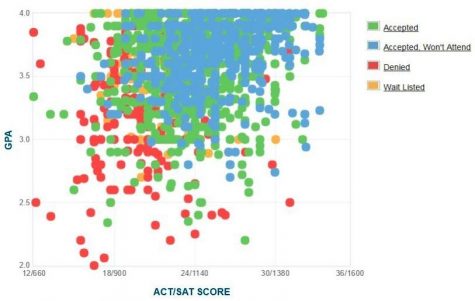
Another way to analyze data is to compare two independent variables to each other. We can use a scatter plot to depict the relationship between SAT and ACT and GPA scores of App State students.
As we can tell, there is a strong visual relationship between high school GPA and ACT/SAT score. For example, GPA increases as test scores increase and vice versa. The strength of the relationship is called “Pearson’s correlation coefficient” or “Pearson’s r.” Basically, a correlation measures the direction and magnitude of two data entries.
Data relationships can be further emphasized via certain statistical techniques. One such method uses algebraic concepts to make a prediction. These equations ask readers what happens if one variable increases, does the other decrease or increase? Thus, we can compare people’s education to predict if their hourly wages will increase. Begging the question does an extra year of education lead to an extra dollar of pay? To find out we’ll use a simple equation below to elaborate further:
Y = a + bx + e
Let’s break this equation down. “Y” represents the dependent variable, dollar of pay; “a” represents the value of the dependent variable when education is the same, “b” represents the independent variable, year of education, and “e” represents other variables that contribute to wage growth. To illustrate this point further, I have made a scatter plot containing two variables: monthly employment from Ashe and Watauga counties from 2005 to 2020:
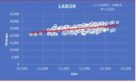
On the graph there is an equation taking the same shape as Y= a + Bx. Y represents Watauga employment numbers, B is the extra jobs added to Watauga following an increase in Ashe county employment and equals the number of jobs in Watauga without any Ashe county workers employed. The results state Watauga’s employment numbers will increase by 2.46 jobs per Ashe County job. This means that if Ashe county expands employment by 100 jobs we should expect to see 246 new jobs in Watauga. Below the equation is the R-squared, which shows how good of a predicting model this equation is. The R-squared ranges from 0 to 1, and the closer it gets to 1, the stronger the relationship. This equation has an R-squared of .221 which explains 22.1% of employment numbers.
How do we increase employment? We compare Watauga to other data variables. We would compare the effect of the relevant factors such as student population per month, number of tourists, etc. to predict the employment in Watauga. This should also result in a better prediction. However, adding additional variables can also reduce the magnitude of others. Remember the error term we talked about in the early equation: Y = a + bx + e. Often, independent variables are correlated with one another. When they are omitted from a regression, the correlation between unexplained parts of the equation are added to explained variables which increases or reduces the significance of the other variables predictive power. In our example, if we add the college student population to the equation we should expect to see a relationship reduction between Ashe and Watauga. Remember how an increase in one job in Ashe county will increase Watauga employment by 2.46 jobs. If we compare Watauga employment with the number of college students per month in Watauga and Ashe County jobs, we should see Ashe having less of an effect.
To wrap things up, data-driven approaches are useful but far from complete. There are thousands of factors that even the best models cannot predict. It is important to understand the limitations that statistical methodologies have or problems that can arise. For example, policing algorithms have been criticized recently for racial bias. The error is likely a result of formulating conclusions based on unexplained variance. As demonstrated with the Ashe and Watauga county example, omitted variable bias of unexplained variance is likely the culprit behind the racial bias in policing algorithms.